Illustration – Futurity Book Cover Design

I was recently contacted by a publishing company who works with authors to illustrate a book cover for a science fiction author. The book’s title was “Futurity” by Daniel Kuehn. The author requested that three of the main characters be incorporated, and provided a description of each and a brief synopses. The author had in mind a certain style and color scheme, and provided a few samples of that. He specifically asked that the main character be wearing jeans and a hoody, with their eyes hidden in shadow. They also needed the artwork done within 4 days. Fortunately I was able to deliver.
 Here is the first sketch I provided them. This took a couple of days of thinking about the brief.
I knew I wanted an ambiguous background, and that a reflective surface would allow for some shadow play. I started fairly monochromatic and developed color as I decided how I would handle the light sources in the image.
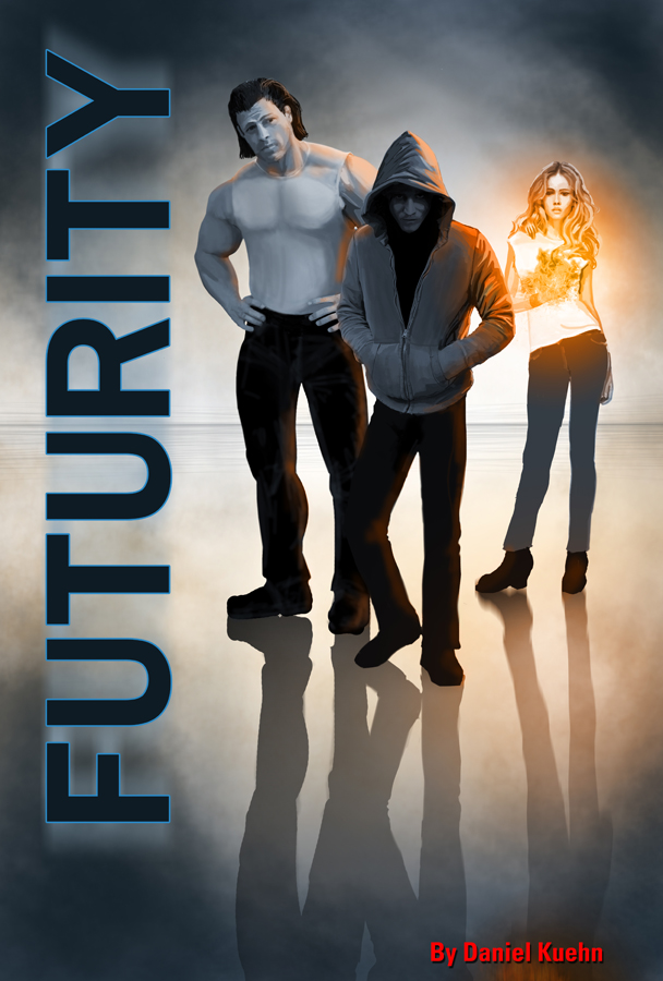
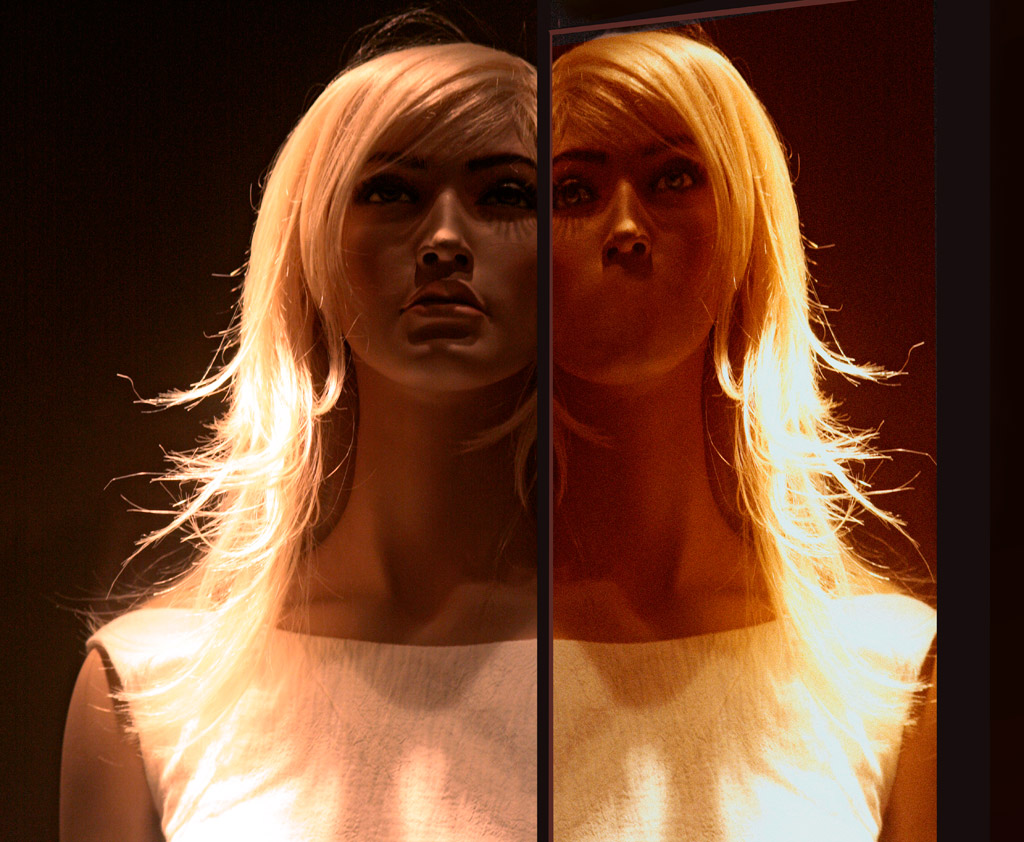
The main character (center) develops some psychic abilities in the story. The girl develops the ability to control fire, and the third character is the muscle in the story.
After taking a break from the initial sketch, I decided there were things that bothered me about it, the girl’s legs, for example, the stance wasn’t quite right, and I also felt it would be more intriguing if she was holding flames in her hand, which then introduced a secondary light source.
Gradually I began to model the figures, adjusting the tone and highlights to make the light sources more logical and consistent. The author also gave me a better description of the third character’s hair.
I modified the shadows to make the surface they were standing on a little more glassy, and compelling. Then I continued modeling the figures.
 This stage involved continued modelling and refining. I wanted to try adding some special effects to the main character, to further disguise their expression, and add more interest to that character.
For that I used a greatly modified lens flare (don’t shoot me – it was appropriate for this kind of effect).
 At this point I began to work on the overall color, making sure it was consistent with the light sources. So the main light was coming from behind the characters, from the ambiguous background, which is what casts the shadows on the surface they are standing on. But the flames also create a light, and the highlights and color had to reflect that.
With a warm light you’ll have cool shadows, so I added a subtle cool tone to the front of the two male characters, while adding a warmer tone to the areas behind and next to them, closer to the flames. The flames also would affect the density of the main shadows.
 For this stage, I continued to bring the values together given the light sources in the image, darkening the tone of certain areas, with final touches to the modeling of certain areas.
I also added a cast shadow of the girl’s arm across her midsection. This had to be diffuse, because the flames were moving. This also meant darkening the underside of that hand. I also added some highlights and shadows to the jeans, and more refinement to the hair.
The last stage then required some overall color grading, to bring everything together.
Update:
Hey, if you are seeing this, you are on my old blog. Be sure to check out my new website with my updated Illustration/Design Portfolio here.
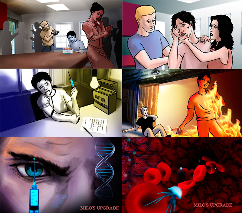
Read More


 Sage Arts Studio